

Squircles (linebender.org)
110 pointsby raphlinus16 hours ago34 comments
scarecrw 2 hours ago
Squircles are an excellent shape, slightly outdone in my opinion by their dimensional older brother the sphube. Both thoroughly described here: https://arxiv.org/abs/1604.02174
PhunkyPhil 2 hours ago
Squircular, Squelched mapping, Squircular Ellipsoid, Squircular Cylinder (sqylinder), Non-Uniform Squircular Cylinder, Squircular Cone, Non-Uniform Squircular Cone, Squircular Cushion, Sphylinder... Good stuff :^)
thot_experiment 40 minutes ago
I'm working on a tool to author better splines and superellipses/clothoids feature heavily. If anyone is interested here's a little demo you can play around with:
It's just a giant stack of edge case exceptions that mostly does the thing you'd expect it to, sorry about the UI, it's very much just in the exploration stage.
mosura 2 hours ago
Generally speaking curves that avoid having discontinuities in their derivatives become hugely interesting the moment you want to interact with physical reality, since they are what enable smoothness. Squircles are just part of this.
0x4e 2 hours ago
This is the kind of wholesome content HN needs more of.
Some hate it, some love it.
My perspective on this post is, great! Another idea I can add to my bookmarks for when I’m designing.
Appreciate the OP!
fiatpandas an hour ago
iOS squircle primarily exists because of Apple's use of it in industrial design. Yes a squircle icon rests easier on the eyes, so it has some function, but IMO it's more a nod to the importance of G2/G3 curvature and Class-A surfaces in Apple's industrial design and CNC process. Objects that are nicer to hold, with much more visually pleasing highlights, and arguably more efficient use of machine time.
fasterik 4 hours ago
For those who are confused by the plot like I was, the horizontal axis is arc length, and the vertical axis is curvature.
croisillon 2 hours ago
and the axis zooms from a maximum of 2 to a maximum of 200
terhechte 4 hours ago
PaintCode! Here's a name I haven't heard in a long time. I had a license for this and one of my Mac apps (InstaDesk, later, PhotoDesk) used it a lot for all kinds of UI elements.
xg15 4 hours ago
Can someone explain the difference to me between a rounded rectangle and a squircle?
TobTobXX 4 hours ago

snug 3 hours ago
I like that he asked this question because that was not a question I thought to even ask
wolttam 4 hours ago
Rounded rectangle is a rectangle with fixed radius corners, a “squircle” is some shape where the corner’s radius is not constant.
(My interpretation)
flowerlad 4 hours ago
A standard rounded rectangle has quarter-circle corners. A squircle starts curving earlier and more gently, with a gradual transition from its flatter sides into its corners.
Personally, I prefer regular old round rectangles. Squircles are ugly.
layer8 4 hours ago
The sides of a squircle never become completely straight, they are curved at every point.
One consequence of that is that they scale more nicely for nesting: https://thatsmaths.com/wp-content/uploads/2016/07/squircles-... (right half of the image)

Of course, Apple’s squircles deviate from that by inserting straight line segments. What remains is that the corners still have a non-constant curvature.
alanbernstein 3 hours ago
On a rounded rectangle, the shape of the corner is continuous, but the curvature is not - it jumps from 0 to R. Rounded rectangles look fine, but if you're attuned to it, this subtle discontinuity can look just a little bit off.
A squircle is one (actually several variations) approach to making the curvature continuous.
I would say it's still a subjective aesthetic difference, but you can use math jargon to explain why you like one better than the other.
YuechenLi 3 hours ago
A regular rounded rectangle is G1 continuous while a squircle (superellipse) is G2 continuous, which means that it is not only continuous on position and tangent for its outline, but the curvature rate of change for the outline is also continuous, so it's smoother and doesn't have hard difference between "line" and "rounded corner" on the shape.
prideout 2 hours ago
Like Raph's post says: squircles do not have a single agreed-upon mathematical definition. I don't think "rounded rectangle" does either.
raphlinus 2 hours ago
I think a rounded rectangle is defined as 4 straight line segments joined with G1 continuity to quarter circle arcs. I'm unaware of any other definition. The only variation I know is whether the radii have to be the same or can be different. Flexible implementations do allow the latter.
Sharlin an hour ago
A highway or railway curve between two straight segments is usually not a simple circle arc. If it were, the sudden discontinuity in higher derivatives (acceleration and jerk) at the transition point from straight to curved would feel uncomfortable, be harder to anticipate and slow down appropriately by a driver, and cause unwanted shear stresses to mechanical parts. So transition curves are used that smoothly vary the curvature from zero to that of the circular segment and back to zero again. The typical transition curve in engineering is called a clothoid, which is one of the squircle types mentioned in the article.
In digital graphic design curvature discontinuities don’t usually cause mechanical issues, but discontinuities in curved shapes can still look jarring – for whatever reason the visual system is rather good at detecting such sudden changes in shapes, even those that naively "should" look smooth.
pampas 3 hours ago
The maths is elegant but I'm really tired of squircle icons. I find them ugly and I want to go back to the good old days where every icon could have it's own distinctive shape which makes that one app much easier to find. The human brain is great at quickly recognizing shapes and angles so why throw it away. Someone got a promotion for squircles.
apt-apt-apt-apt 2 hours ago
I find rounded rects to be jarring in their harsh edges, while squircles fix that.
coolfox 2 hours ago
don't let the models see this. they're obsessed with rounded corners
vindex10 3 hours ago
I came here expecting squirrels, haha)
cyberax 2 hours ago
If you're interested in squircles, also make sure to read about squigonometry: https://en.wikipedia.org/wiki/Squigonometry
There's a wonderful book about it: https://link.springer.com/book/10.1007/978-3-031-13783-9
MitPitt 4 hours ago
Too bad squircle corner shape (along with scoop, notch, bevel) are only available on chrome as a CSS feature, but not firefox or safari. I hate rounded corners in UI, with a passion.
layer8 4 hours ago
I dislike rounded corners as well, but also when they are squircles.
whoishiding 3 hours ago
Kiki gang, represent! https://en.wikipedia.org/wiki/Bouba/kiki_effect
somat 2 hours ago
Firefox recently went hard on really rounded corners in a recent version, and me being an antique interface connoisseur went "Oh hey, project athena is back" an aesthetic I find hideously ugly.
The fun thing is athena toolkit widgets can actually be made to look halfway decent. Put a "*shapeStyle: rectangle" in your xresources. My xmessages have never looked sharper. [1]
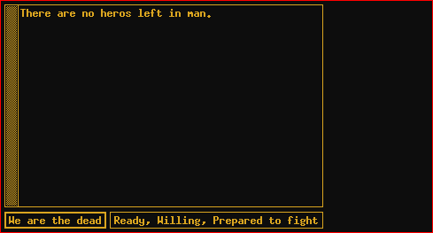
1. A blatant lie, I have it themed to look like an old amber monochrome monitor. But "if" I had employed some tasteful pastels my xmessages would look sharp. https://nl1.outband.net/image/xmessage.png
asddubs an hour ago
support is coming though. It's in the safari tech preview and the latest nightly firefox, too
ex1fm3ta 3 hours ago
The new Apple product HomeView is a Squircle https://www.apple.com/ca/shop/buy-home/apple-homeview/apple-...
xunil2ycom 4 hours ago
If anything never needed to be examined, it is this.
random3 3 hours ago
go on..
osnxwknxeidj 2 hours ago
Dude out here trying to gatekeep research with “scientist” in his bio.
Amazing.