

https://developer.mozilla.org/en-US/docs/Web/CSS/Reference/V...
Safari introduces Adaptive Dark Mode in 27.3 (webkit.org)
359 pointsby paddingtone8 hours ago203 comments
kickingvegas 7 hours ago
FYI, light-dark() in CSS is a thing now.
kps 7 hours ago
And `:prefers-color-scheme` has been supported by all major browsers for seven years.
jansan 7 hours ago
And broken in Chrome since the beginning:
kulahan 7 hours ago
So I guess it hasn’t been supported anywhere in a sense.
Safari and Firefox are pretty small.
zamadatix 7 hours ago
I wouldn't call this part of the situation a bug. I'm sure everyone has their own opinion about which is the "right" way to handle a mismatch of OS level preference and browser level theme though.
The underlying problem is Chrome exposes no (normal) setting to override the OS level setting at all, not necessarily that the preference shall always follow the browser's theme specifically.
omer_balyali 7 hours ago
This issue is related to appearance setting inside Chrome itself (which sets Chrome's appearance, not how it should work with websites AFAIK). The core feature of prefers-color-scheme (following the OS-level setting) is working as intended.
jansan 6 hours ago
It is not true that prefers-color-scheme should always follow the OS-level setting. The doc says "The method by which the user expresses their preference can vary. It might be a system-wide setting exposed by the Operating System, or a setting controlled by the user agent."[1]
So if the user sets dark mode in the browser, do they not explicitly express their preference for websites? How could they be more explicit about the setting?
[1]https://drafts.csswg.org/mediaqueries-5/#prefers-color-schem...
omer_balyali 5 hours ago
I didn't meant that "only OS-level setting should be respected", what I meant is that Chrome's setting is how Chrome themes should look like, not for websites.
Chrome already has a setting to change a specific website's color-scheme, although it's only working when Developer Tools is visible (then with Cmd+Shift+P "Toggle CSS media feature prefers-color-scheme"), so CSS implementation actually follows respecting UA-level preference over OS-level setting.
But again, Chrome doesn't have a feature that lets users to choose which color-scheme they want to browse the web (so there is no bug, but it's a UX issue because their Appearance settings doesn't make it clear to the users what this setting changes) other than the setting they gave to developers. Honestly I would love to see all browsers have an option for how color-scheme settings should apply to websites.
jansan 5 hours ago
You can set the appearance mode (light, dark, device) under chrome://settings/appearance . If you change the mode, the settings page (which is a website) adopts that mode, so a user would naturally assume this is also the mode for displaying web content.
omer_balyali 5 hours ago
Yes it's confusing for the end-user, as I said they should improve their UX in that setting page to make it clear what this setting changes.
However, your original comment was saying that prefers-color-scheme is bugged in Chrome is not true. It works as intended: it follows both UA-level and OS-level settings correctly.
The settings in Appearance tab is not a setting for preference when browsing the web. Many apps have a setting to choose if their app should change appearance when OS setting changed (or to override it), they could simply leave out this setting and let Chrome chrome (app ui) always follow the OS setting or always be in default light mode, instead they gave users to choose "how their Chrome browser will look like", not "how every website they visit should look like".
cosmotic 7 hours ago
Windows 3 through windows 7 had pervasive support for dark mode as long as application developers didn't custom paint their user interfaces. Application developers started out almost all supporting system colors and gradually over the next 25 years or so started implementing their own custom-drawn interfaces, accelerated by embedded IE/mshtml views and then later even more by Electron. This concluded with practically zero interfaces supporting the system color scheme.
toyg 6 hours ago
Yeah, when dark mode became "a thing" my first reaction was "...didn't we have this already?"
I was a theme junkie back in Windows 98 times, but stopped bothering since it became increasingly clear that Microsoft was not really interested in supporting them after XP.
da_chicken 6 hours ago
Yeah but "dark mode" for Win3 through WinXP was primarily to support passive matrix LCDs, which required inverted color schemes to appear with enough contrast to read. That is why the built-in "high contrast" color schemes look so aggressively awful.
Rohansi 5 hours ago
Custom painting isn't the only thing that broke it. You can customize the style (colors) of the native widgets to get a desired look but IIRC you could choose from system colors (follows the theme/mode automatically) or exact colors. Some applications used a mix of them which made the UI look awful if you switched away from whatever the default theme was.
akersten 6 hours ago
It makes me so angry that they named the CSS function `light-dark` instead of leaving the door open to allowing generic user- or site-specified color schemes. I mean it was right there in all the other mechanisms around this feature, they just had to read and think about why these are structured the way they are, and why "light" and "dark" were always values and not keywords in all of these..:
    - <meta name="color-scheme" content="light dark">

    - :root { color-scheme: light dark }

    - @media (prefers-color-scheme: dark) { }

    - <picture><source media="(prefers-color-scheme: dark)">
Did they not look at the prior art and notice that "one of these things is not like the other?" All the other pieces of this puzzle, conceivably, could have one day had something like `:root { color-scheme: halloween }` or `@media (prefers-color-scheme: supercontrast)` but no, we're just going to cement `light-dark()` as the only two possible color schemes we'd ever want to switch between forever.
have_faith 6 hours ago
It’s always irked me that light and dark are given privileged positions in the namespace. They’re just themes (or schemes if you like), like all the other possible themes.
steve1977 11 minutes ago
I'd argue that they are modes of themes, not themes themselves.
tshaddox 4 hours ago
I’m not sure what kind of function you’re asking for that would support arbitrary user-defined themes. With the if() function and/or @function declarations you could build pretty much any system you want for defining theme-specific values for arbitrary themes.
hexasquid 4 hours ago
Web standards are discussed in the open aren't they?
I'll see if I can find what reasoning lead to this.
hexasquid 4 hours ago
https://github.com/w3c/csswg-drafts/issues/7561 appears to be a place to start digging
omer_balyali 4 hours ago
Color schemes (luminance modes) and color themes (aesthetic styles) are not the same thing. Halloween theme can have light and dark schemes.
Also, prefers-contrast media query exists, which can be used in combination with the luminance modes (color-scheme): halloween-light, halloween-dark, halloween-light-high-contrast, halloween-dark-high-contrast.
nsoam 7 hours ago
I want the opposite. I suffer from astigmatism, which makes white on black hard to read. I wish Safari could turn dark mode websites into light mode websites.
jimbobimbo 6 hours ago
I have similar issue with dark mode applied to content - hurts my eyes. I prefer to have window chrome in dark, to make "fade away". The only application which allows me to have my cake and eat it is Firefox: I can run Windows in dark yet read web in light mode.
I wish Windows would steal this feature for the whole OS: I don't want Notepad to use dark for text, but per-app setting usually turns the whole app light.
0x1F8B 6 hours ago
I have 20/20 but for some reason cannot handle dark mode except for two things, terminal and coding and I cannot do light mode for either of those.
But whether it is my os ui or my phone ui, I feel like I can't distinguish borders and boundaries in the UI as well as I can with light mode.
cj00 4 hours ago
Yeah I can’t do dark mode websites because they leave an after image for some time after reading. So I made a Force Light Mode extension that just applies an inverse to any site that forces dark mode on me. Safari 27 now has some Siri extension builder, maybe it can build it for you.
marcellosso 7 hours ago
I use dark mode for everything, so I'm pretty happy about this. Some sites were clearly designed to be light, and forcing dark on them could break the experience, but that's exactly what `color-scheme: light only` is for, and it's good that Safari respects it. Other than that it feels like a win-win to me: great for dark mode users, and for devs not much changes, you just add "light only" if you don't want your site to be affected.
greazy 7 hours ago
Everyone should checkout Dark Reader extension, it's been doing adaptive dark mode for many years, and it's customisable. It even does light mode too. Using it in Firefox on HN right now!
ckdot 7 hours ago
Slows down loading of websites a lot though.
Telaneo 6 hours ago
A slowly loading website is preferable to a quick flashbang.
lnvdpwl 7 hours ago
I just noticed that Dark Reader stopped working for me. Turns out I accidentally installed "Dark Mode", a potentially malicious clone that got blocked :/
tehnub 7 hours ago
I like that on Chrome, and while it works on Safari, I prefer Noir there.
chrisra 6 hours ago
I'm concerned that these extensions can "read and modify" everything. I can't use that for work.
accelbred 6 hours ago
AFAIK, its detectable by the web page though
NooneAtAll5 5 hours ago
Dark Reader went political - that's an automatic "NO" from me
kstrauser 3 hours ago
What do you mean?
voxic11 an hour ago
They posted about the was in Ukraine being bad and their disappointment with the Belarusian governments participation in it. https://darkreader.org/blog/no-war/
kstrauser 19 minutes ago
I'm a little shocked and disappointed to find that's considered "going political". Sigh.
macNchz 6 hours ago
Personally I'm excited for this on iOS—I find that reading boring stuff in dark mode at minimum brightness on my phone is easily the most effective way for me to fall asleep (contrary to the blue light/no phones in bed advice). With an OLED screen the amount of light emitted is so much lower than any alternative I've tried. For sites like HN (some threads on HN are pretty boring) that don't have a native dark mode, my solution has been setting up the "Accessibility Shortcut" feature to invert the colors on the screen. Three clicks on the lock button and the page inverts. It works okay, but it requires manual intervention for each site depending on whether it supports dark mode.
mh- 6 hours ago
I have been using a Safari extension called Noir on iPhone for years. Works great on HN and most sites. I have it set to a pure black for HN. Easy to disable per-site when it fails. It syncs to my phone's dark mode. I also read in bed as you've described, with Night Shift turned on and very low brightness. It's great.
JulianPaul 7 hours ago
Am I still the only one who doesn't use dark mode? My astigmatism can't take it
madeofpalk 7 hours ago
No.
isityettime 7 hours ago
Is your astigmatism uncorrectable?
sheept 7 hours ago
Even if it were, it’s easier and more reasonable to fix your app to work with your users, than fixing your users to work with your app.
isityettime 5 hours ago
Everyone deserves configurable and hackable apps, which is the only real way to work towards universal accessibility.
I can't personally support light modes in my own software because I can't use/test them, but I'd still add an untested one and fix bug reports about it.
I'm just curious about what people mean when they talk about astigmatism in this context, because the term is usually thrown around without qualifications (plain "astigmatism" as opposed to "irregular astigmatism" or "uncorrectable astigmatism"). So I'm curious about the astigmatism of people for whom dark mode on glowing devices is a problem. Is it typically extremely severe? Is it typically uncorrectable? Is it that people's glasses or contacts are often subtly wrong/outdated? Are many astigmatics not myopic or presbyopic enough to wear glasses all the time anyway? Astigmatism is a broad category and I'm curious about the specific impairments people who avoid dark mode have, in part because I have astigmatism and nonetheless prefer (require, really) dark mode because of other vision problems.
much-to-learn an hour ago
My astigmatism is very regular, very mild, correctable, and corrected. Dark mode is still awful for me. Gives me visual snow side effects after too long and generally just makes the astigmatism symptoms worse.
It’d be great if Apple could try this hard in the iOS messages app where there the keyboard is now only dark mode when a background is set.
kps 7 hours ago
Not them, but my left eye isn't fully correctable. The average dark mode site looks like I'm driving the Las Vegas strip in the rain.
figmert 7 hours ago
For me I cannot deal with dark mode in bright environments, but equally it's fairly hard (though less hard) when using light mode in dark environments. It's why Dark Reader has been such a huge quality of life improvement for me.
redwall_hp 7 hours ago
I find dark mode is better for astigmatism, personally. It also isn't hellish if you have floaters and migraines, unlike light mode.
The preference, either way, is an important accessibility feature.
loloquwowndueo 7 hours ago
No, you’re not the only one, I can’t read dark mode, it’s all blurry, makes me squint and gives me a headache. Light colors all day long. Light mode is not a mode - it’s the default.
nozzlegear 7 hours ago
I don't use it either, and find most website dark modes really difficult to read. The text blurs together or worse, it gets "burned in" to my vision briefly (not sure what that phenomenon is called). I especially dislike the ones that are pitch black instead of the cool grey/dark grey. I was hoping this "Adaptive Dark Mode" announcement was going to adaptively do away with the pitch black dark modes that make it impossible for me to read a website by adapting them to any other color scheme. =P
wiredfool 6 hours ago
No, After a few minutes of dark mode, I get essentially zebra stripe like migraines.
MBCook 6 hours ago
No. It’s stupid. There’s a reason we don’t write white text on black paper. There’s a reason the first Mac showing black text on a white background was such an improvement.
I don’t get the point at all (and don’t want to hear it, I’ve seen the arguments before).
It’s nice it’s there for people who want it but it baffles me it’s constantly treated like the greatest thing ever.
echoangle 6 hours ago
> There’s a reason we don’t write white text on black paper.
Because wood is bright and you can’t really print white ink on a black paper?
There might be a usability advantage but using black ink on white paper doesn’t really prove that, that’s just the easier option of the two possible choices.
MBCook an hour ago
It’s easier, sure. Especially at first. But we’ve had paper for a while now. Different colors of ink too. If light text on dark background was superior, we would be using it. And could have for hundreds of years for anything considered important.
kalleboo 4 hours ago
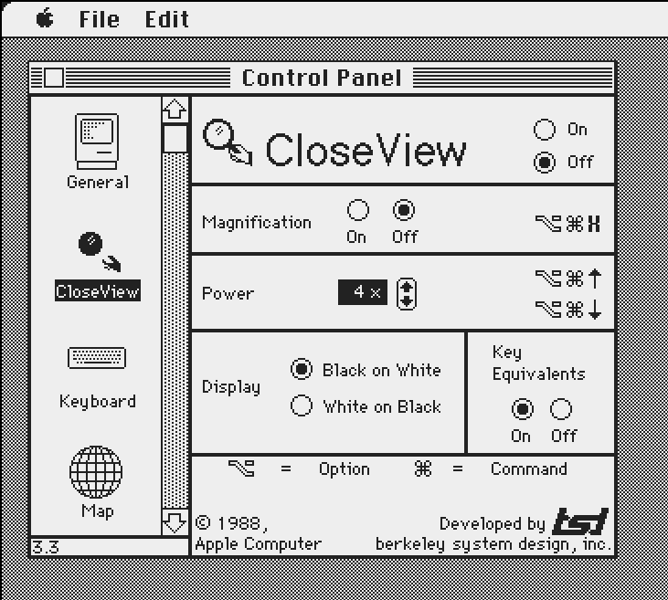
> There’s a reason the first Mac showing black text on a white background was such an improvement
Apple soon started offering a dark mode as an accessibility feature https://kalleboo.com/linked/mac_closeview_control_panel.png
MBCook 4 hours ago
That’s an accessibility feature.
It was not an intended way to use things all the time for a large chunk of the user population.
Not the same.
bondolo 4 hours ago
Yeah, just wait until you are not the target market.
Telaneo 34 minutes ago
> No. It’s stupid. There’s a reason we don’t write white text on black paper.
That being that black paper is more expensive than white and that we're stuck with historical precedence?
Reading white text on a black background is much, much easier for me, and the few times I've had the pleasure of doing the same with paper, I still found it to be better. I haven't tried longer texts, since nobody's publishing actual books with black paper, but I'm willing to bet it I'd feel the same about those.
This just reads to me the 'serifs are important because they make reading easier (when reading of paper)', which doesn't reflect my lived experience at all. The only reason these phenomena seem to exist are historical accident and people being used to them.
ninkendo 5 hours ago
I use light mode in the day when it’s bright, and dark mode at night when it’s dark. Neither mode is “better” for me, but two things are true for me:
- Dark mode is harder to read when it’s bright out
- Light mode is blindingly bright when I’m in a dark room (and turning the brightness sufficiently low makes everything look washed out.)
My devices change from light mode to dark mode at sunset and it’s basically ideal.
Also it’s nice to just have less artificial light as the sun sets, which makes falling asleep naturally a bit easier.
rbits 4 hours ago
That's why every site should respect the user's light/dark preference when possible. Dark mode vs light mode is very divisive
consumer451 3 hours ago
I have the opposite issue. That's why I have my system theme set to dark, and likely you to light, and this has existed for years:
https://developer.mozilla.org/en-US/docs/Web/CSS/Reference/A...
It's 2026, how does every single website, especially this one, not support this?
cosmic_cheese an hour ago
I didn’t used to mind “light mode”, but then flat design took over and the midtones and grays that often composed light mode were replaced by huge swaths of stark white and near-white grays which is blinding at normal display brightness and then too low contrast to work well with low display brightness. After a while of that I started to enable dark mode whenever a platform made it available.
If/when flat design goes the way of the dodo and light themes are designed sanely once again I’ll pick them back up.
Reason077 7 hours ago
Hacker News itself is a prime example of a website that doesn’t support dark mode, but could do so trivially (and, IMO, would look so much better if it did!)
loloquwowndueo 7 hours ago
Please no. Dark mode is extremely difficult to read for me.
simonjgreen 7 hours ago
Are you supposing they would they force it on for you? Or does your dislike of it mean nobody else should have the option?
dmd 6 hours ago
This is, in fact, what drives a lot of politics. "I don't like X therefore nobody may have X."
doublepg23 5 hours ago
Bean Soup Theory: https://www.merriam-webster.com/slang/bean-soup-theory
peregren 7 hours ago
That’s why it’s a mode :-)
davidhs 6 hours ago
I'd prefer dark mode because then I notice my eye floaters much less when reading.
Mistletoe 6 hours ago
Ironically this comment is now almost impossible to read.
therealmarv 6 hours ago
there are a lot of design choices which Hacker News does not support ;)
quantumink 6 hours ago
My HN is in dark mode, though the honors for that accomplishment go to the duckduck browser. Been reading HN on dark mode a while now (light mode burns me eyes, only way to use HN for me now is with the Duck)
P.S. the Duck browser literally has a universal dark mode setting, I don't recall a site it wasn't able to dark-force darkify for me (language is fun)
ivanjermakov 6 hours ago
There is no downside to having prefers-color-scheme media query set up, even for HN. Too bad still roughly 1 in 4 popular websites support it.
NooneAtAll5 5 hours ago
no, choosing light/dark mode should be manual
Rohansi 5 hours ago
Per website...? Why would anyone want that instead of just using the system-wide preference? Many sites/apps have an option of system/light/dark.
hackinthebochs 3 hours ago
For me, most dark mode styles are awful (jet black background bright white text). I'd rather have per website toggle so I can apply my own styling when the site's styles suck.
codazoda 5 hours ago
Hard disagree here. Follow my system default.
entropie 4 hours ago
Iam a both kind of guy.
eek2121 5 hours ago
No, it should follow system defaults with an option for a manual override. People like you are the reason the internet is broken.
altairprime 6 hours ago
They’re now formally interested in doing one but, I imagine, not very urgently relative to flag reasons and other stuff.
consumer451 6 hours ago
I got neurological lyme disease a few years ago. Anything with a white background was like a VGA cable being half plugged in.
The fact that this website wasn’t capable of dark mode made me create a CSS overlay on desktop.
I am back to somewhat normal now with my eyes, but I feel really bad for anyone in the same position.
I know that the current exact HN is magic, but come on. There is CSS to detect the system’s theme. There is no need to create a button or anything.
tensor 5 hours ago
Dark mode and some small improvements for mobile usage would be amazing and don't seem at all hard. It's pretty amazing HN hasn't implemented them.
drnick1 5 hours ago
HN works just fine on mobile. I am posting from a GrapheneOS phone. If it ain't broke, don't fix it.
kzemek 5 hours ago
I misclicked "hide" on quite a few articles when I meant to read the comments
bmurphy1976 5 hours ago
I disagree. It's pretty terrible. I use hackerweb.app on mobile and it's much better however it doesn't support posting. Thus I have to torment myself with the regular website to post a comment such as this.
accrual 5 hours ago
If anyone here is open to using the Stylus extension, I've re-shared a dark theme for Hacker News recently and it's been lovely. [0]
eek2121 5 hours ago
I hate that folks recommend random extensions. Browsers should include style/css editors (with the ability to save and reload styles later) for accessibility. Since we don't have that, uBlock Origin does a lot of heavy lifting, and can add a dark mode to HN and other sites.
I'd share my ruleset, however, I am missing one. Before I switched PCs (motherboard caught fire) I had one that made everything dark mode, didn't dim the text, and buttons/text inputs/other inputs were also properly inverted. I had to make it myself because googling Hacker News dark mode always led to the same broken themes. I forgot to back it up. Adding dark mode doesn't need a bunch of extensions, and while I'm sure the "stylus" extension is probably useful (I haven't used it, sounds like a CSS override extension), UBO does CSS and JS.
Just my thoughts. Don't mind me.
brigandish 4 hours ago
I still miss Omniweb, a browser with user defined stylesheets, per site settings, and workspaces… so many good things. Free browsers killed it off.
plorkyeran 4 hours ago
Opera had this in 2003, but sadly none of the major browsers copied it.
accrual 4 hours ago
Indeed, I just figured I'd share the full setup. IIRC, Stylus was derived from "Stylish", which was a hugely popular CSS override extension that became spyware around 2016 and was taken down in 2018, and now Stylus (and others of course) fill the gap. It would be very nice to have this integrated into the browser, I agree.
postalcoder 5 hours ago
https://hcker.news was originally made so i didnt solar flash my kid in bed while they were sleeping
it now has many dark themes, bloomberg is my favorite.
gooseyman 4 hours ago
It's great!
Where are the themes? (I might be missing on mobile)
postalcoder 4 hours ago
my bad, upper right corner half moon icon!
gooseyman 4 hours ago
Gotcha I was looking for a Bloomberg terminal like theme, whoops
postalcoder 4 hours ago
Whoops is on me, I misunderstood your question. That theme is there, you have to long press the theme button. Just realized how unintuitive it is, gonna move it to the settings.
gerdesj 4 hours ago
No thanks. When you are my age you will understand.
I have no idea why all the fucking vibed websites that swank around the web these days are unable to do a simple thing:
  * Have one or more "themes" with dark and light variants
  * Query the browser for a preference of light or dark and offer the default theme with the probed variant.
It's 2026 FFS. Why on earth is this even being discussed as an issue? We have all these cool vibed efforts that can't even be bothered with simple basics.
cheald 4 hours ago
I use Stylus to apply a dark theme to HN, and much prefer it. https://i.imgur.com/USbXXEK.png

aleksandrm 4 hours ago
People should stop using Imgur. 99% of the time when I click an Imgur link, I get a 403 Imgur is temporarily over capacity. Please try again later. I highly doubt that they are, and they are just blocking VPNs.
cheald 4 hours ago
If you've got a better suggestion, I'm open to it. I generally just want a throwaway place to host an image publicly for a specific purpose.
willio58 4 hours ago
I use a chrome plugin precisely for this and I can confirm - my eyes hurt less
matthova 4 hours ago
The only chrome extension I have is to make hackernews support dark mode. Love having it
I do appreciate how minimalist hackernews tries to be, but I think respecting the operating system's theme can be considered very minimalist
SpliffnCola 4 hours ago
Not sure if you would like my dark mode modifications to HN, but here are my CSS[1] and JS[2] modifications.
Javascript: https://pastebin.com/50EUfktL CSS: https://pastebin.com/nzEhxxBY
internet2000 an hour ago
This feature works well on Hacker News, just trying it on the beta.
hahnchen 7 hours ago
Does it go the other way? What if I want light mode on a website that looks dark
kps 7 hours ago
You're out of luck if, like me, you have a problem with astigmatic halation. All the cool kids use dark mode.
iOS since 26 has been presenting parts of the system in dark mode despite having the device set to light only. One of the ‘best’ is that launcher groups switch to dark background, but they forgot to switch the text colour, so app names are unreadable. I had hoped iOS 27 would fix it, but no, so I'm switching to Android.
much-to-learn an hour ago
Yeah, same here. Insanely annoying to have your own phone get made less accessible for you.
AndrewStephens 7 hours ago
This is a good thing.
I added dark mode to my blog a while ago and it was a little trying to do properly.
You can implement a half-assed dark mode yourself by adding the following css.
  @media(prefers-color-scheme: dark) {
    body {
      filter: invert();
    }
  }
madeofpalk 7 hours ago
filter: invert() hue-rotate(180deg)
analog_daddy 5 hours ago
Yep! That’s what is my dark mode userscript too.
Reference for anyone interested in more details.
https://monochrome.sutic.nu/2024/02/25/hue-preserving-invert...
sheept 7 hours ago
The opt outs mentioned in the article, like
color-scheme: light dark;
For icons, ideally they’d be SVGs controlled by currentColor, but that may not be feasible or convenient depending on your setup.
iza 5 hours ago
Please do not use invert; it messes up subpixel rendering, making text ugly and harder to read.
stwrt 6 hours ago
As a user, I'm really excited about this. There are still so many websites that don't support dark mode.
Having built websites myself, I know how much attention it takes to make sure every page and component looks good in both light and dark mode.
It's not perfect yet. Even in the second demo, you can see that the chart remains white, creating a stark contrast with the rest of the page. But it's a great step toward making dark mode work across the web without requiring every developer to implement it themselves.
drnick1 5 hours ago
Why are people now so obsessed with dark modes? 20 years ago it wasn't a thing at all and computers were just as usable, if not more in some regards. If you wanted a "dark mode" you switched to a tty.
sdf4j 5 hours ago
Not true. Also 20 years ago we were still using 14” CRTs.
seanwilson 6 hours ago
> When transforming text color, Adaptive Dark Mode aims for sufficient contrast as defined by the WCAG 4.5:1 contrast ratio.
The WCAG 2 contrast checker is known to be inaccurate, specifically for light on dark color combinations (i.e. dark mode) meaning 4.5:1 isn't always going to be easy to read so it's surprising they're not at least using a higher ratio. The APCA contrast checker (was being considered for WCAG 3) is more accurate at measuring readable contrast levels and the docs explain the problems with WCAG 2 more:
https://git.apcacontrast.com/documentation/APCAeasyIntro.htm...
jordand 7 hours ago
I was looking through 'Dark Mode' browser plugins for viewing websites last week, and the options aren't great. The 'Dark Reader' plugin that's everywhere sends a lot of silent web requests in the background that seems strange given its mostly just CSS tweaks.
cluckindan 7 hours ago
Bad: it’s tracking you
Worse: it’s attacking you
Worst: it’s attacking someone else as you
DuncanCoffee 7 hours ago
I use stylus on firefox, you can search for styles or write them yourself. I often write dark mode for websites, I'm using a dark mode for hn right now. Also "large mode", it's ridiculous having websites on a 32" limited to 900 px
figmert 7 hours ago
I'd be curious to know more about this. Dark Reader, at least on Firefox, is a recommended addon, which means it gets additional scrutiny by Mozilla. I do agree though that if it does additional web requests, it seems fishy. Do you have any details on where these requests go to or how you found them?
pamcake 7 hours ago
You can inspect requests yourself by either:
- Checking "Enable remote debugging" and "Enable chrome and add-on debugging toolboxes" in devtools settings, opening Browser Toolbox (Ctrl+Shift+I), and looking at the "Network" tab
or
- Enable add-on debugging and inspect the addon from `about:debugging`
pamcake 4 hours ago
Correction: C+A+S+I
speedping 7 hours ago
PSA: Noir is a safari extension that does exactly this and it’s fantastic. Miles better than Dark Reader on performance and refinement. Costs a few bucks but it’s one time and totally worth it.
PalmPilotProMax 5 hours ago
>cost a few bucks
Sounds like the Noir dev is going to be the next victim of Apple's Sherlocking.
accidc 6 hours ago
Does this also address the momentary flash of blinding white, often when pages transition/fail to render
drusepth 7 hours ago
Really happy to see this. Users begged me to add dark mode to my sites for years and it's been nothing but a pain to support since adding it. If other browsers pick up something similar, I look forward to the day I can finally remove "manual" dark mode support and just leave it up to the browser.
pamcake 7 hours ago
> I look forward to the day I can finally remove "manual" dark mode support and just leave it up to the browser.
Today it is!
https://developer.mozilla.org/en-US/docs/Web/CSS/Reference/V...
https://developer.mozilla.org/en-US/docs/Web/CSS/Reference/A...
saagarjha 7 hours ago
I guess if you truly don’t care about it sure, this is probably going to be an improvement, but if you are willing to invest even a bit of effort I strongly think you’d want to decide how your website looks like in dark mode.
drusepth 6 hours ago
I'd estimate I've probably spent 100+ hours testing and fixing dark mode issues over the past 5-10 years. Investing "a little bit of effort" is how I got myself into the trap of doubling+ UI QA time to make sure everything _also_ looks good in dark mode (and also in dark mode across a matrix of other configurations) every time I want to ship anything new to users.
I know some people care about dark mode (and that's why I bit the bullet to add it), but I'd honestly much rather have spent all that time working on actual features.
efields 4 hours ago
This is awesome because I like reasonable solutions that let me be lazy.
I'm sure there are designers that love dealing with two themes, and will do beautiful work within each theme.
But I'm really fine with letting the computer figure it out. CRM, back office tools, admin dashboards... many clients are approving one design and dark mode is an afterthought. Why can't the computer just... do it for me, and do a better than passable job at that.
hinkley 4 hours ago
Modern CSS has some simpler mechanisms to deal with the light/dark dichotomy now. I translated a blog to support dark mode recently and it wasn't that difficult. The two sticking points were <code> and picking foreground colors that didn't blend in, and the github icon.
The other was Github's icon. But `filter: invert(1)` does a pretty decent job of handling that as long as the icons are black and white.
reader9274 7 hours ago
Finally a fix for HN
kkotak 7 hours ago
Please! I don't use Safari so this won't help me, but switching back to HN from other mostly dark themed sites hurts my eyes :(
famfamfam 6 hours ago
Chrome also has a functional adaptive dark mode (no extension required!), but it is hidden behind an experimental flag `enable-force-dark` as an origin trial on desktop. I am surprised that the Chrome team have not surfaced this to users earlier (outside of Android Chrome, where it is available as a 'Dark Mode' toggle).
To try it, go to chrome://flags and search for Dark Mode, then enable Auto Dark Mode for Web Contents.
Alternatively, you can toggle it on using the Chrome DevTools Rendering tab, as "Enable automatic dark mode"
arccy 6 hours ago
Some pages break badly... like google docs and some QR codes
tiffanyh 4 hours ago
What’s the relationship for Safari and Safari Tech Preview.
Because correct me if I’m wrong, neither of these features were in the Tech Preview.
And numerous features have been in Tech Preview that have never made it into mainline Safari.
stwrt 3 hours ago
Safari Technology Preview is primarily for testing the latest WebKit features, rather than previewing every upcoming Safari feature.
Safari Beta is generally what you'd want to use to test features coming to the next Safari release.
And yes, features appearing in Technology Preview aren't necessarily guaranteed to ship in Safari.
sivanmz an hour ago
Why can’t HN provide a dark mode?
pazimzadeh 7 hours ago
Finally..
In dark mode, any windows that aren't dark can be huge eyesores.
I recently made a menu bar utility to enable per-window color invert for this reason: https://github.com/pazimzadeh/WindowInvert/
It helps for apps that don't have dark mode yet (Pages, etc) and even some apps that do (Preview has a dark mode, but it doesn't work on old PDF's).
senderista 7 hours ago
I just wish all websites supported reader mode.
bla3 7 hours ago
I know it's always been this way, but it's weird to me that Apple uses the WebKit blog for Safari product announcements.
kccqzy 6 hours ago
It’s not. The feature is implemented deep within WebKit so it makes sense to be on this blog.
> It’s precisely because Adaptive Dark Mode is happening deep within the WebKit browser engine that we are able to find creative ways to solve the most complex challenges, apply the transformations with great speed and power efficiency
gooseyman 4 hours ago
This is great.
I use the brave beta appearance option "Dark Mode" and every now and then a site is almost unreadable.